
Should World Maps in Classrooms be Mercator or Peters?

 World maps have featured in classrooms around the world for hundreds of years. Despite all the technology that is now available to teachers, a big map on the wall remains an excellent teaching resource. But the world map you knew in school could change to a very different looking map - one that depicts true land masses.
Traditional Mercator Maps isn’t True to Size
The maps and atlases we used were based on the Mercator’s map. In 1569, Flemish cartographer Gerardus Mercator drew his map to assist with navigating colonial trade routes. He drew straight lines across the oceans, exaggerated the size of the northern hemisphere and placed Western Europe in the middle of the map to suit the needs of traders.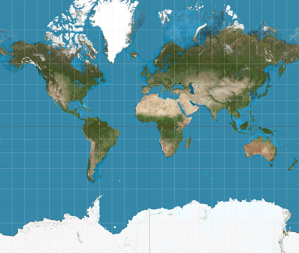 Mercator Projection
Peters Map - Projection World Maps
German historian Arno Peters published his projection map in 1974 which matched work by a Scottish 19th-century mapmaker, James Gall. Now known as the Gall-Peters projection, the ‘equal-area’ map distorts the shape of countries as a two-dimensional visualisation of a three-dimensional globe. The result is a more accurate scaling of land surface areas and effectively rewrites the traditional 500-year-old Mercator map. The new Peters Projection map shows a much larger South America and Africa while Europe and Alaska have shrunk in size. Effectively the bulk of the western world has become smaller, and the developing world has increased in size. Being in the southern hemisphere, Australia looks larger and elongated compared to its northern hemisphere counterparts. All North-South lines run vertically on the Peters map so geographic points can be seen in their precise directional relationship and show equal positions. All East-West Lines run parallel. Thus the relationship of any point on the map to its distance from the equator or the angle of the sun can readily be determined.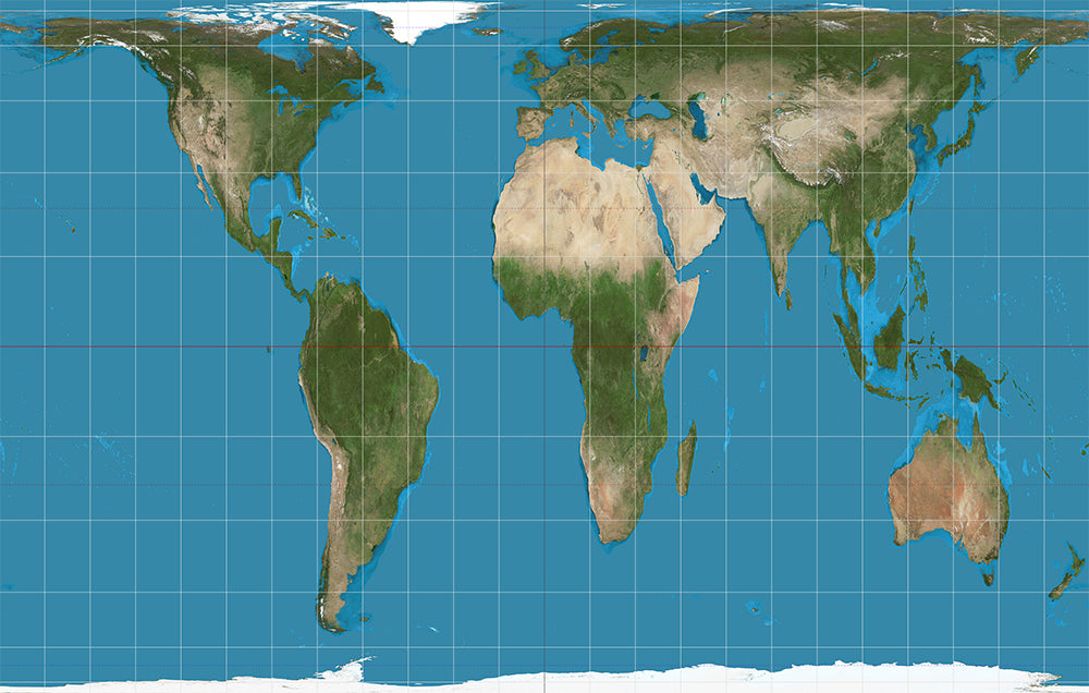 Peters Projection
Will Peters Projection Maps become standard?
The English version of the Peters Projection Map was launched in 1983, and since then there has been a robust debate on how the round earth should look on a flat paper surface. In recent months Boston public education in the US with a population that is 86% Latino and non-caucasian has announced that it is phasing in Peters Projection Maps in all of its schools. Only time will tell if schools around the world follow Boston’s lead and favour the true depiction of land mass or stay with the traditional Mercator maps.World Maps for Classroom Resources
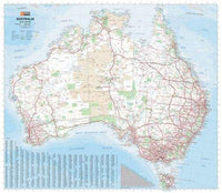
The Chart & Map Shop stock Mercator and Peters Projection World Maps suitable for use in school classrooms. The Peters Projection World Map is available in a large 1.6m size and a smaller 1.1m size as well as in different languages including Geman, Spanish, French and Arabic. If you are looking for a traditional Mercator map for the classroom, the colourful World Executive Supermap is over 1.8m wide, large enough for all students to crowd around. There are usually one or two children in every classroom with colour blindness, so there is a range of maps available to students suffering from any type of colour blindness. The 1.4m Political Map of the World - Colour Blind Friendly uses mainly pink, purple and grey tones. Remember, you can have any size map laminated for a longer life and to make it easier to hang and move around the classroom. If you have any queries about a world map suitable for a classroom, office or home, contact us in-store or online.Featured collection


Categories:
news
Posted on: May 26, 2017


Comments